
New Jira Cloud Navigation Tour
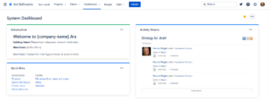
Between March 2025 and July 2025 Atlassian progressively rolled out a new navigation experience to all Cloud users in Jira, […]
Between March 2025 and July 2025 Atlassian progressively rolled out a new navigation experience to all Cloud users in Jira, […]
CoursesLearn about Jira and Confluence BooksDownload manuals, worksheets, and materials ServicesGet consulting and Jira implementation help Latest Jira Content
Transcript Hi, I’m Rachel Wright, Certified Jira administrator and author of the Jira Strategy Admin Workbook. I started using Atlassian
A better navigation for Jira Cloud is coming soon! While we wait I thought it would be fun to dig
Each quarter, Atlassian has a 24 hour hackathon, called ShipIt, where they stop all work duties to create something awesome.