
A better navigation for Jira Cloud is coming soon! While we wait I thought it would be fun to dig up some old screenshots and take an unofficial and outsiders look at how the Jira interface has changed over the years.
When Jira was first released in 2002, it was purely for software development. But these days, all kinds of teams, like Legal, Marketing, HR, and IT, use Jira to track their work and their team’s “to do” list. Jira is useful for any industry and it’s not just for software development anymore!
The modern Jira experience is much different than what launched in 2002. Jira has evolved into different application types and different deployment methods. You can choose between Jira Core for business teams, Jira Software for development teams, and Jira Service Desk for support teams. You can also choose Jira Cloud (Atlassian hosted), Jira Server (hosted on-premises, in a data center with your other internal applications, or in a Cloud server environment like Amazon AWS), or Jira Data Center (also self-hosted but built for mission critical environments.)
It’s no surprise that the application’s design, look, and navigation has changed drastically over the years. Here are a few examples of the visual evolution.
In the Beginning
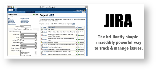
In 2002, Jira looked just like all the other web applications did at the time. As a web developer, I remember web application design closely mirrored desktop application design. It felt like developers were porting their applications to “web format” and wanting them to behave the same way as the PC versions did. User interface standards were just emerging. Websites were mostly grid based and layouts were in box or table format. In the Jira 2002 screenshot example you can see the familiar “logo in the top left header” standard that we all still expect today.
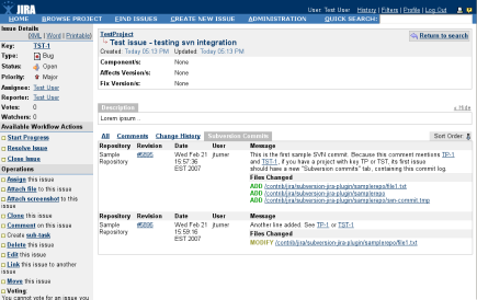
In 2007 the logo and header changed slightly but the overall layout remained the same. The issue screen doesn’t yet have the right sidebar to display people and date fields. This design reminds me of what you see today when you export Jira filter results for printing.
In 2009 Atlassian acquired GreenHopper which added release planning, burn down charts, and many of the agile features we use today. I still remember installing GreenHopper as an app and when “Agile” was a link in the top nav.
Into the Cloud
In 2011, Atlassian created a cloud-based version of Jira. It looked and functioned just like the self-hosted version. It was originally named “JIRA OnDemand” and the on-prem version was called “JIRA Download.” The names were re-branded in 2014.
Also in 2011, the Jira admin interface received a new project-centric design. I’m very thankful for the quick nav and keyboard shortcuts. I use the “gg” shortcut daily to move around the admin area.
Originally named RapidBoards, Scrum Boards graduated from the labs sandbox and became a standard feature in 2012.
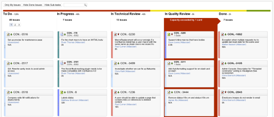
Just two years later, the board design looked more polished with assignee avatars, different placement for priority icons and estimates, and improved spacing.
In 2012, the Atlassian Design Guidelines (ADG) were published to unify the customer experience across products. Hooray for consistency and standards! This meant the typography, spacing, and layout in Jira would be similar in Confluence. Jira 6, released in 2013, was the first “ADG compliant” version.
In 2013, the workflow designer was rebuilt in HTML 5. I remember when HTML 5 was the latest and greatest thing in web development! We all hoped it would replace Adobe Flash. Flash support officially ends in Dec 2020, but I haven’t seen a Flash-based website in years.
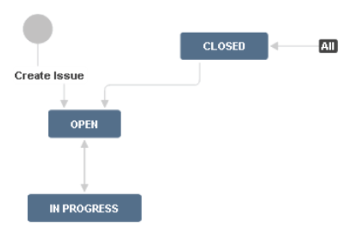
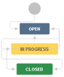
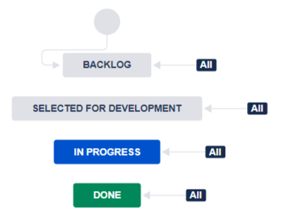
Back in 2013, all the workflow statuses were one color. We didn’t see different status categories, colors, or lozenges until version 6.2 in 2015. Different status colors helped end users understand whether they were in the beginning, middle, or end of an issue’s life cycle.
Custom status icons were also eliminated in 2015. Anyone remember those? I don’t think anyone misses them.
New Designs for new Application Types
In 2015, Atlassian split Jira into two application types: Jira Core and Jira Software. Core featured a simplified interface aimed at business teams. Software retained development-specific features like versions, sprints, and dev tool integration. In the Jira Core screenshot below there are few links in the left nav.
As the applications diverged, sometimes new features were built in one type but not in the other. For example, Jira Cloud got a new visual roadmap feature and Jira Data Center got archive abilities. Design differences emerged and even some terminology changed. Cloud has a global permission called “Share dashboards and filters” but the same feature in Server is named “Create Shared Objects.” All these small differences are certainly challenging for me. It’s harder to use both application types at the same time and to keep training materials up to date. Even Atlassian has to maintain separate sets of documentation.
In 2016, the atlassian.design domain was registered to house their design principle documentation and brand information. Their style guide is a fabulous example for other organizations to follow. I especially like how easy their logos are to download and the “don’t do this” logo crime samples.
Also this year mobile Jira apps for IOs and Android were launched with their own platform-specific features and design.
In 2017, Atlassian re-branded their entire corporate identity introducing a new logo, individual product logos, and renaming “JIRA” to “Jira”. Branding modifications are inevitable as companies grow and change. This is the fifth Atlassian logo change in 15 years. There’s a great graphic showing the logo evolution here. The new logo symbols feel multi-dimensional, fresh, and modern. It will be a long time before I can update every instance of “JIRA” to “Jira” in my book and on my website though!
Jira Cloud UI Overhaul
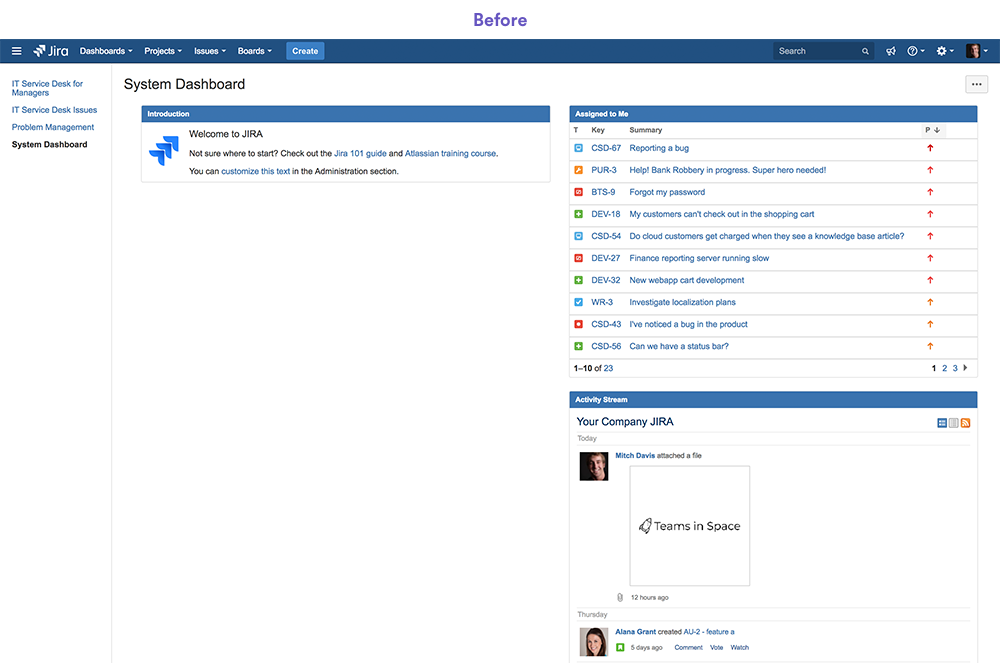
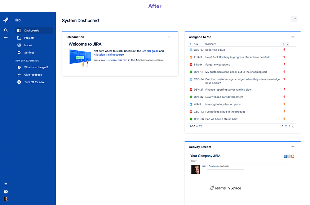
Also in 2017, Atlassian departed from their previous interface strategy. They announced “Jira Cloud will get an updated look and feel, including a collapsible sidebar navigation and enhanced search, to help your teams get things done faster.” The new nav was completely different from the top horizontal navigation in Jira Server and in previous Cloud versions.
I had trouble finding my way around and noticed more clicks were needed to get to some areas. The large left side bar commanded a lot of visual space. It was collapsible but you’d need to expand it again to access certain links. Sometimes the navigation loaded after the page contents loaded. Most annoyingly, the nav’s vertical scroll bar made it hard to print or screenshot pages. This navigation reminded me of designing with HTML frames in early 2000.
Source: Your teams are getting better navigation in Jira Cloud
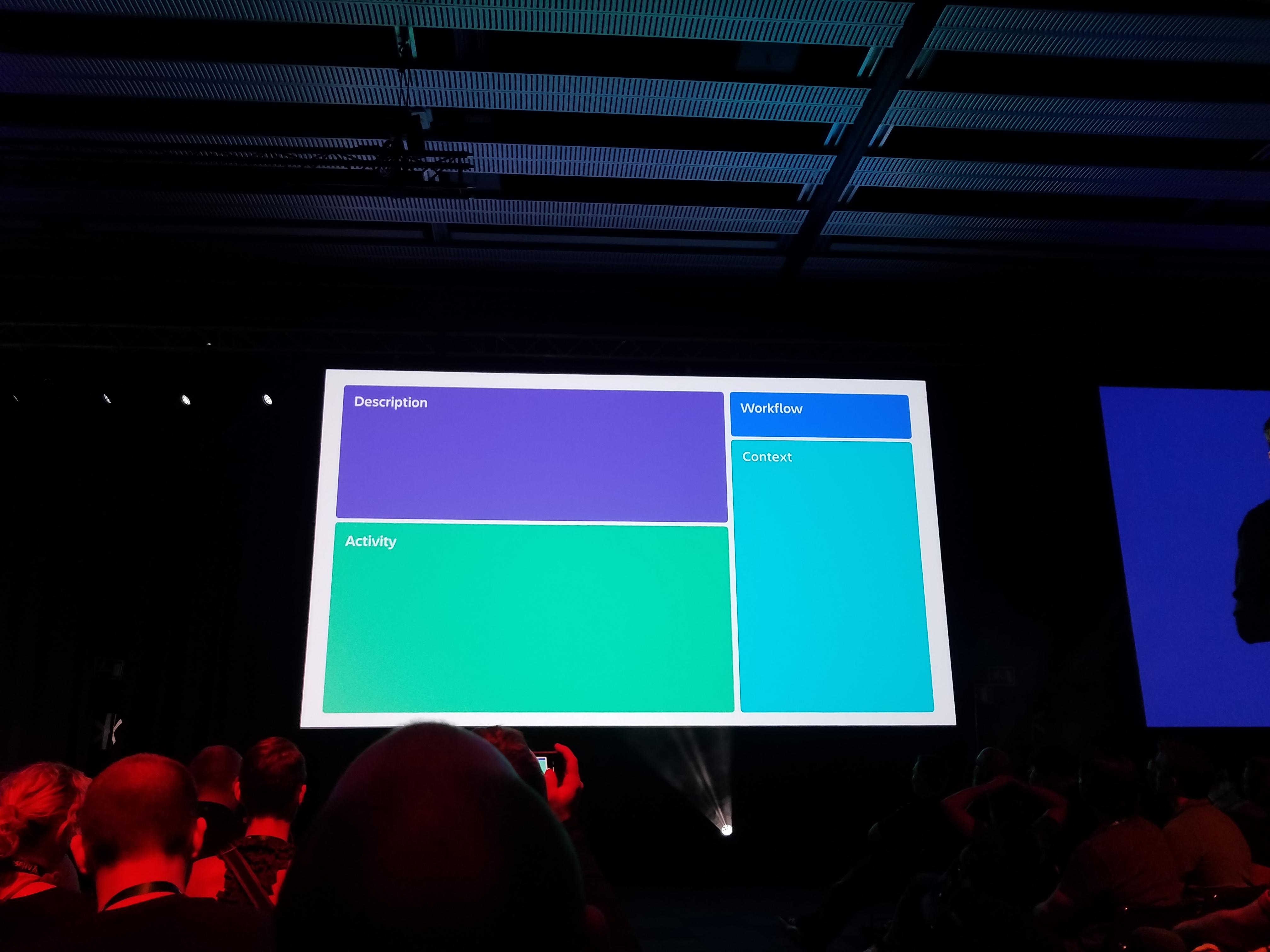
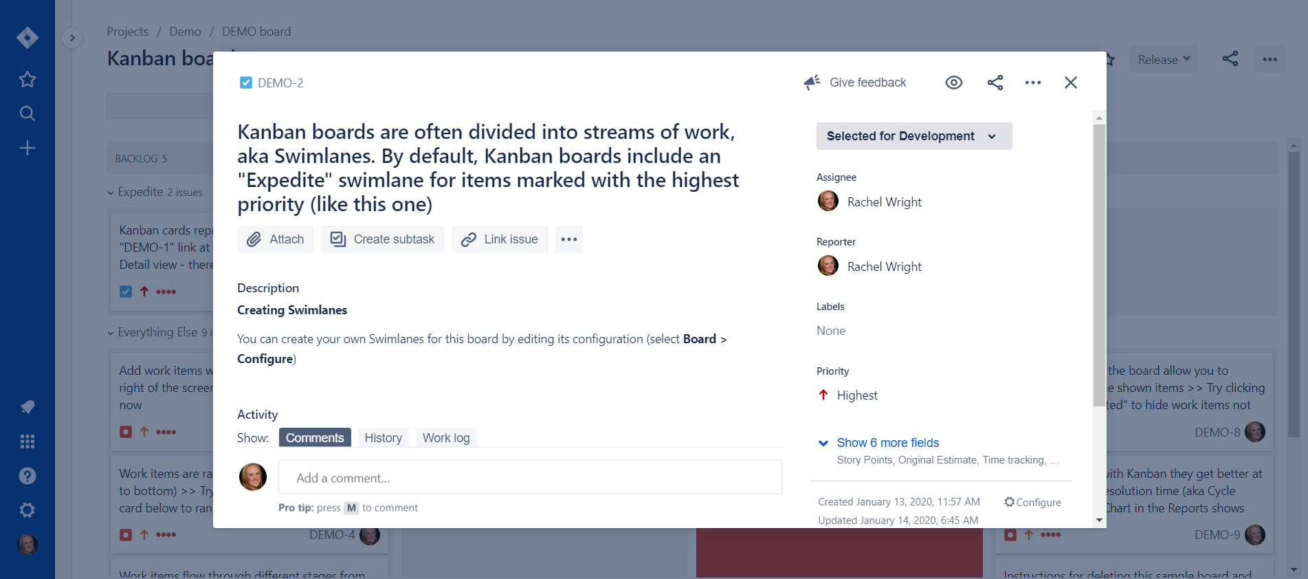
In 2018, Atlassian took inspiration from the Japanese, Taiwanese, and Chinese bento box to redesign the Jira Cloud issue view. This design divided and grouped key actions and information, much like how rice, meat, and vegetables are separated in individual portions.
Also In Jira Cloud:
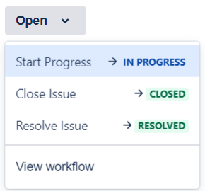
Workflow transitions were simplified. They ware displayed vertically and at the top of the right sidebar.
The separate “view” and “edit” screens were collapsed into a single screen. As such, there’s no “Edit” button and and all fields received inline edit capability.
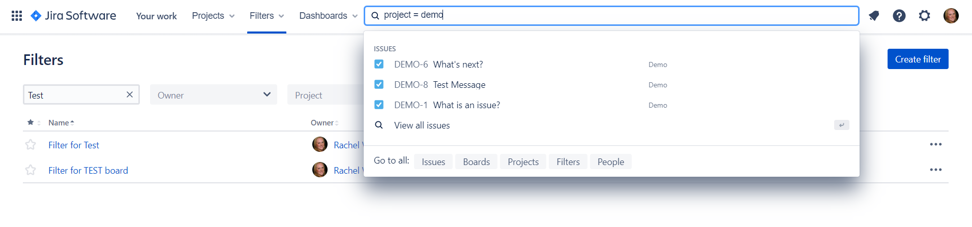
New search capabilities were added. A keyword search very quickly returned recent issues, boards, projects, and filters. I found myself wishing I could enter simple queries in this search bar.
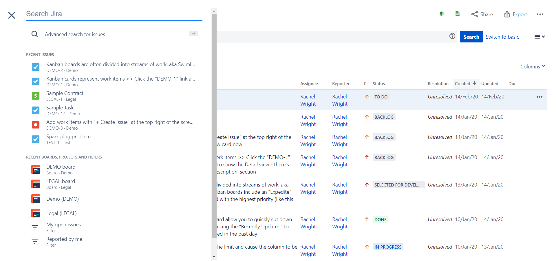
Clicking an issue from a board opened it in an overlay. When you closed the issue, your board was still there in the background.
Joining the Next Generation
In 2018 Atlassian introduced the concept of next-gen projects for Jira Cloud. This special project type is scheme-less. Project settings aren’t shared and settings don’t impact other projects. The simple configuration interface lets end users quickly create new projects on their own. Read my thoughts on next-gen projects here. Another Cloud feature, Agility boards were also introduced.
The Next-gen interface for adding custom fields and organizing them on screens is simple and intuitive. (Left screenshot below.) But I find the issue screen itself unbalanced. (Right screenshot below.) Most of the fields are stacked on the right side. When there are a lot of fields, they are collapsed and you have to click around to find them. Without a long description, attachment, or comment list, there’s a lot of unused white space on the left.

Jira Cloud Next-gen Project Configuration
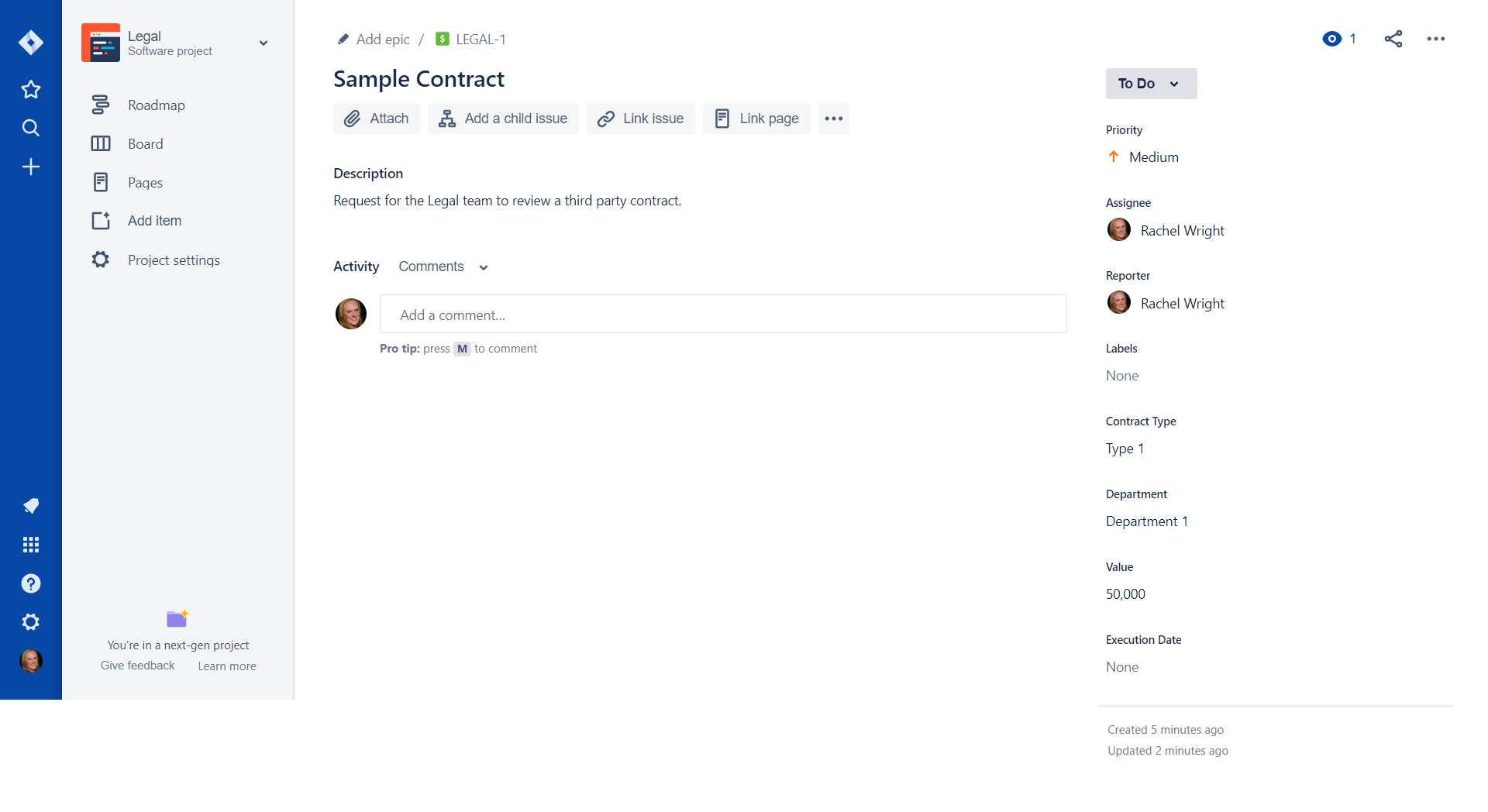
Jira Cloud Next-gen Issue
Also in 2018, Atlassian split their design guidelines, creating one version for Cloud and one version for Server. The Atlassian Design Guidelines version 3 was published and workflow statuses received new colors.
2020 and Beyond
The new Jira Cloud horizontal navigation launches in March 2020! I’m looking forward to returning to Jira’s navigation roots and what I’m used to. As another user put it “What’s old is “new” again?” Yes, it appears so and I’m very happy about it. Since I use both Cloud and Server, I’m also glad that the nav will be similar again.
Change is the only thing that’s certain. We must all learn to work with it and retrain ourselves and our end users when necessary. I haven’t loved absolutely every change Atlassian has made, but every change is an opportunity (either for me or for them) to learn something new. I’m looking forward to the changes in 2020 and beyond.
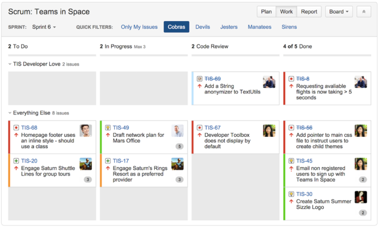
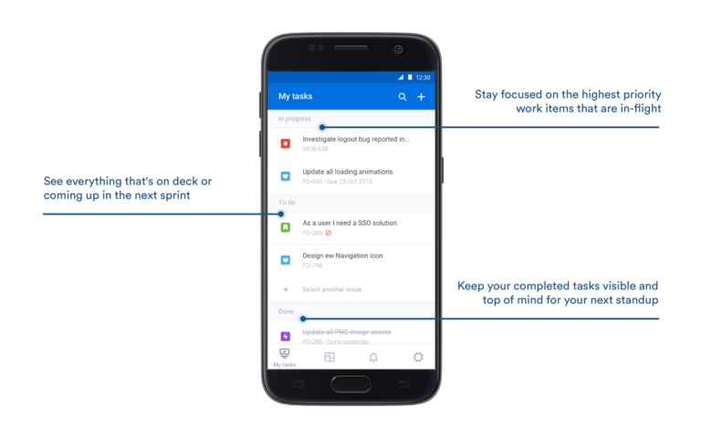
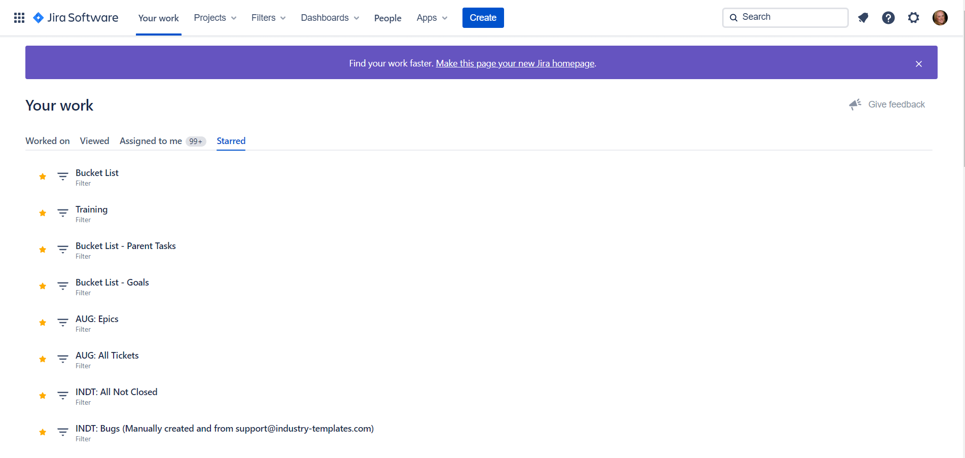
While you’re waiting for the new Cloud nav to arrive in your instance, here are some early screenshots of the latest look and feel.
Update: The experience was fully delivered to all new and existing applications in June 2020. As of September 2020, the old navigation is no longer available for users to switch back to.
2021 – Jira Work Management (JWM) is launched to help business teams collaborate and work in one place.
2023 – Jira Product Discovery (JPD) is launched to help product teams track and prioritize ideas.
2024 – Jira Software and Jira Work Management are combined under the brand name Jira.
Like Atlassian history? Also read: Jira Evolution Continues with Idea Tracking, Summit Through the Years, and Jira Cloud Navigation Comparison
Pingback: Jira Cloud Navigation Comparison - Strategy for Jira®
From Atlassian: Atlassian Design Guidelines has transformed into the “Atlassian Design System”.
“Feedback from an external audit and multiple customer satisfaction surveys nudged us to combine the Atlassian Design Guidelines and Atlaskit sites…” “…we aimed to create a source of truth — for designers, developers, and content designers — through a unified destination that is easy to update, contribute to, and build upon.”
Read more at: https://medium.com/designing-atlassian/our-new-home-for-atlassian-design-system-7ec766cf36cd or see the result at: https://www.atlassian.design/
Pingback: Choosing the right Jira project type - Strategy for Jira®