
Are you migrating from Jira Server to Jira Cloud (or vice versa)? The user interfaces are similar, but there are some differences to prepare for.
In early 2020 Atlassian started incrementally delivering a new navigation experience for Jira Cloud. The return of the horizontal navigation makes the application look similar to Server, but there are still UI differences to be aware of.
Here’s a Cloud vs Server comparison so you’re prepared for migration. The Server screenshots are from version 8.7.1.
Nav Comparison
In Server, the default navigation bar has a dark blue background with white text. In Cloud, the default navigation bar is white with grey text.
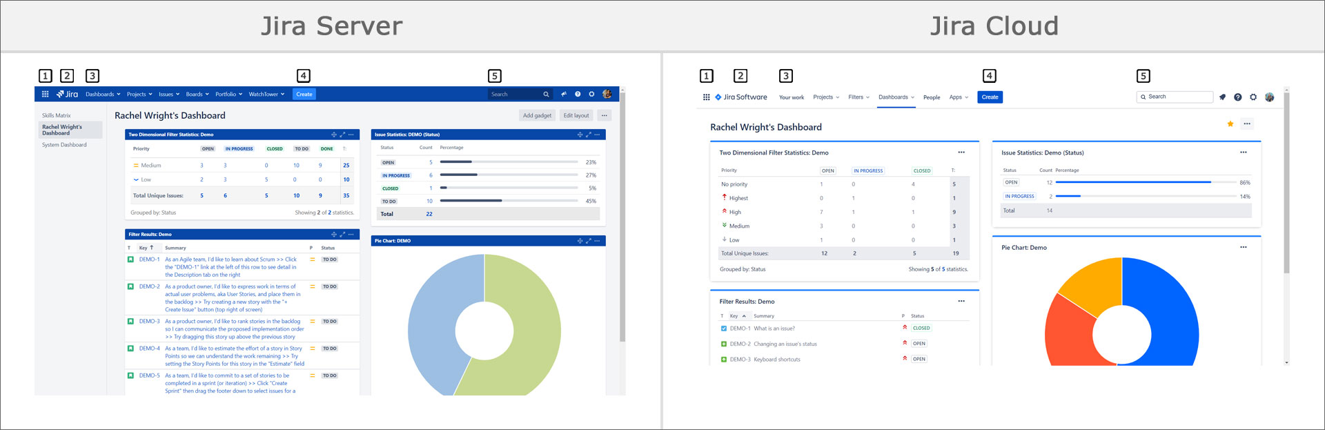
Compare the numbered areas in the left “Jira Server” image to their equivalent locations in the right “Jira Cloud” image.

View Comparison Graphic
- Application navigator icon – Switch to a different application or explore new Atlassian applications.
- Jira logo – This is the “home” link. Click this to go to your most recently viewed dashboard. The logos differ between application types.
- Navigation links
- In Jira Server, the links are: Dashboards, Projects, Issues, and Boards. If you have apps (add-ons), there’s one additional link for each. In the screenshot example, there’s an additional link for “Portfolio” and “Watchtower”.
- In Jira Cloud, the links are: Your work, Projects, Filters, Dashboards, and People. If you have apps, there’s one drop down menu for all of them. In the screenshot example, the final link is labeled “Apps”.
- The “Your work” page is only available in Cloud. Use it to see a list of issues assigned to you or worked on. Also see your recent or favorite issues, filters, boards, and dashboards.
- On small screens, the menu collapses and options are moved under a “More” link. See an example below in the “Workflow Status & Transitions” section.
- Create button – The create new issues button is located at the top middle of every Jira page. In Cloud, for small screens, the button changes to a “+” sign. See an example below in the “Workflow Status & Transitions” section.
- Search text field – Search for issues by key phrase. In Cloud, also search for recent boards, projects, and filters.
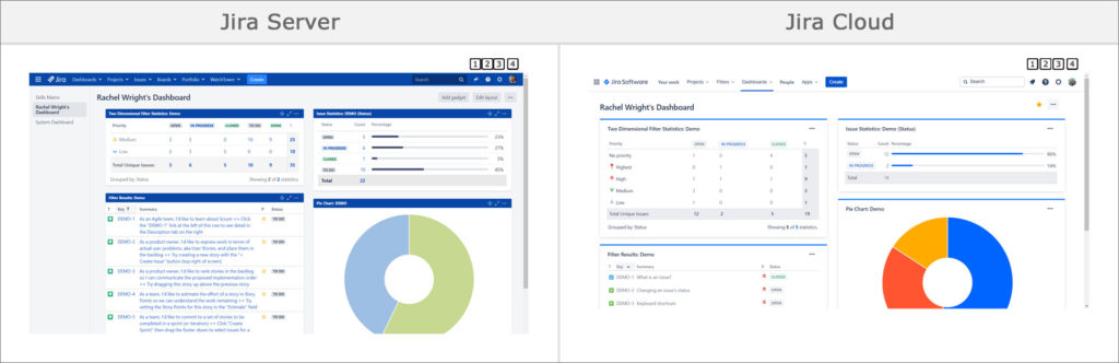
View Comparison Graphic
- Feedback icon (Server) or Notification icon (Cloud) –
In Server, the first icon on the right is a bull horn. Click it to send product feedback to Atlassian. In Cloud, the icon is a bell. Click it to see notifications and updates on issues you’re watching. - Help icon – Use the “?” icon for the keyboard shortcuts list and links to documentation and other resources. The Cloud menu also contains a link to the Atlassian Community and a “What’s New” page.
- Settings icon – Use the “gear” or “cog” icon to access application settings. In Cloud, end users also see this icon and can access additional personal settings for their Atlassian account and Jira notifications.
- Avatar icon – Access your account and personal settings.
Selected Pages
Here are comparison screenshots of commonly used Jira areas. In all comparisons feature placement is similar but colors, icons, and text treatments differ.
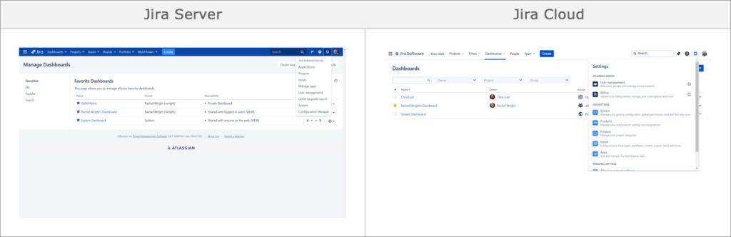
Dashboard
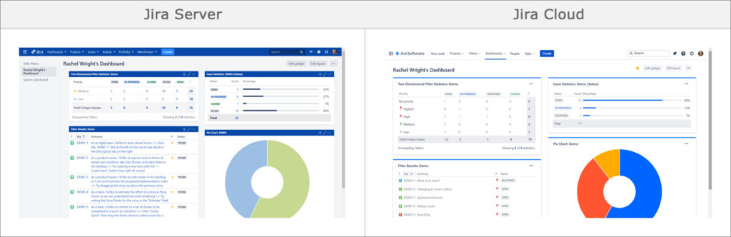
The dashboard pages are very similar. In Server, there’s a left sidebar which lists other dashboards. Without the left nav, there’s more horizontal room in Cloud to show gadget data.
In Cloud, on the top right, there’s a yellow star icon next to the “Add gadget” button, indicating this is a favorite dashboard.
View Comparison Graphic
Projects List
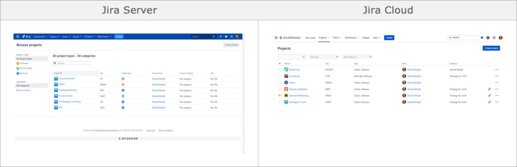
In Jira Server, the Projects page includes a left sidebar to segment the project list. The table shows icons for different project types. A table column, for a project’s associated URL, is displayed.
In Cloud, segment the project list using the text box and drop down menus at the top. In the table, there’s a column for favorite projects, project types are shown in words, and the lead’s avatar icon is displayed. The associated URL shows as a link icon and there’s a “…” menu for project actions.
View Comparison Graphic
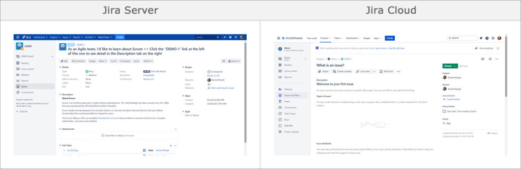
Issue Page
Both screenshots show a Jira Software project, called DEMO, with automatically loaded sample data.
- Sample data
- In Server, the sample data shows a user story for an Agile team using Scrum.
- In Cloud, the sample data shows a simple Summary and Description for a first issue.
- Editing
- In Server, there’s an “Edit” button below the Summary field.
- In Cloud, there’s no similar button. To edit a field, simply hover over it and change its value inline.
- Standard and custom fields
- In Server, the issue detail fields are on the left and the people and date fields are grouped together in the right sidebar.
- In Cloud, most fields are in the right sidebar. When there are many fields, they are collapsed and require an extra click. In the screenshot example, click the “Issue Details” header to see the the “Due Date”, “Time Tracking” and “Sprint” fields.
- Status
- In Server, the Status is displayed towards the top center of the page, just above the “Resolution” field. In the screenshot, the Status is “To Do” and the Resolution is “Unresolved.”
- In Cloud, the Status is displayed at the top of the right sidebar. The “Resolution field” is directly to the right. In the screenshot, the Status is “Closed” and the Resolution is “Fixed”.
View Comparison Graphic
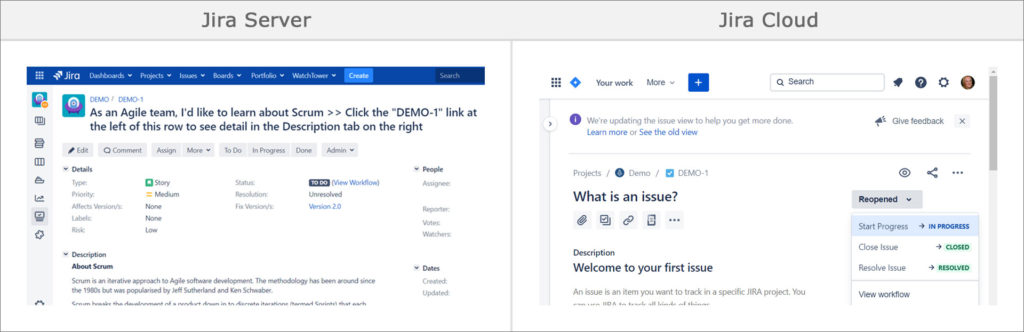
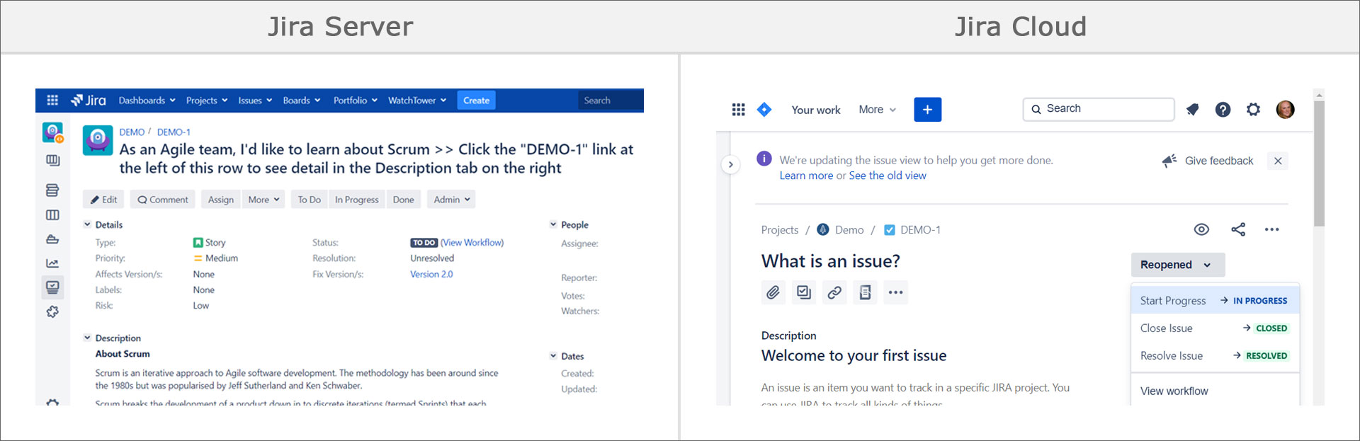
Workflow Status & Transitions
The status and transition display differs between the two deployment types. In Server, the transition buttons are in the issue’s top button menu. The “View Workflow” link is shown to the right of the status. In the screenshot, the transition options for the “To Do” status are “To Do”, “In Progress”, and “Done”.
In Cloud, the status and transition buttons are shown in the right sidebar. In the screenshot, the transition options for the “Reopened” status are “Start Progress”, “Close Issue” and “Resolve Issue”. The destination status is shown next to the transition name. The “View workflow” option is shown below the transitions.
Also shown: In Cloud, when the screen is small, the issue’s top button menu collapses, showing icons without text.
View Comparison Graphic
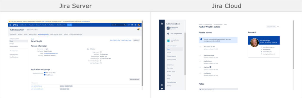
User Profile Page (Application Admin View)
The admin view of the user profile page looks very different. In Server, the profile page is within Jira and there’s a “User statistics” area on the right. At the top of the page is a yellow websudo banner, reminding the user they are in an application admin area.
In Cloud, this page is part of the admin.atlassian.com site and the account is tied to an Atlassian ID. The access statistics are shown in the “Access” area on the left and there’s an additional section called “Roles.” The roles are multi-app, Cloud-only, concepts and are different from Jira project roles. The options include: Basic, Trusted, and Site Administrator (shown). On the top right is an impersonation button labeled “Log in as user”.
View Comparison Graphic
User Management Admin Page
Just like above, the “User management” page in Server is part of Jira and the same page in Cloud is part of admin.atlassian.com. The Server view shows drop down menus to filter the user list. Those same menus appear in Cloud when more users are added.
More data is displayed in Server. For example, there are table columns for Username, Group name, Applications, and Directory. In Server, you can perform some user management functions, like adding groups, using the “…” menu.
Cloud has a different user management system; there’s no concept of username or directory. The “…” menu simply leads to the user’s profile page. Finally, Cloud has an “Export users” button at the top right.
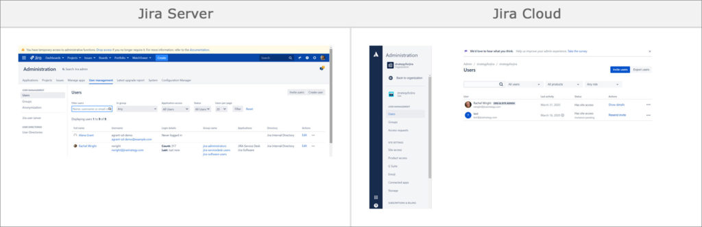
View Comparison Graphic
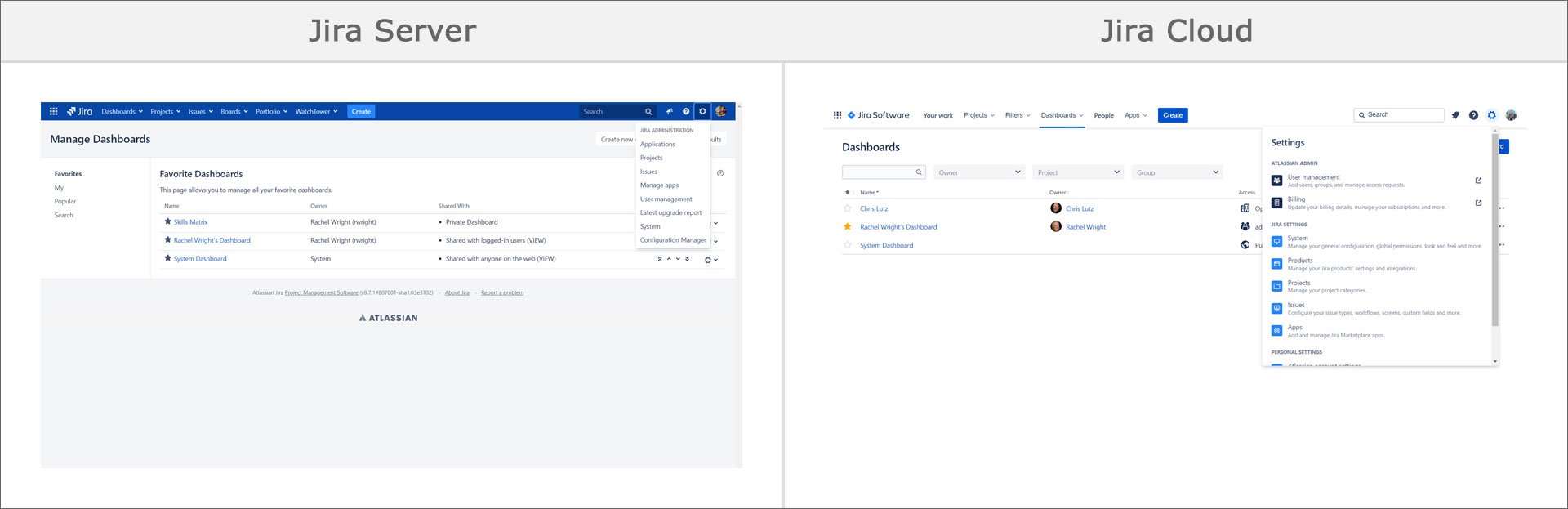
Settings Menu
The text treatment, ordering, and options in the Settings menu differ between deployment types. In Server, the “cog” or “gear” icon only appears for application admins and project admins. It contains links to admin-only areas.
In Cloud, the icon appears for all users. End users only see the bottom section labeled “Personal Settings” however. For admins, the link named “Products” in Cloud is called “Applications” in Server. The Cloud “User management” and “Billing” links take you away from Jira to admin.atlassian.com. Clicking on the “Projects” link takes you to the “Project categories” page.
View Comparison Graphic
Update: The experience was fully delivered to all new and existing applications in June 2020. As of September 2020, the old navigation is no longer available for users to switch back to.
Like Atlassian history? Also read: Evolution of Jira Design