
There are two things we know for sure about forms – One: everyone fills out forms, and two: no one likes filling out forms. With that in mind, your goal in designing the layout of your forms should be to help the user get through the form quickly and easily while providing accurate information.

With multiple options for label placement, help text placement, validation, action buttons and page layout – webforms provide multiple ways to pose questions to users. For the purpose of this article however, we’ll be focusing on Jira forms. We won’t get into the weeds about whether or not your labels should be above or to the left of your input fields, because Jira doesn’t offer options on all of those details.
Instead, we’ll focus on three big principles – minimalism, logical structure, and a clear path to completion – that will ensure your forms (Jira screens or ProForma forms) are as user-friendly as possible. Rather than thinking in terms of what information we need, we will look at the problem from the user’s point of view. Who are your users? What are they trying to achieve by filling out the form?
Let’s get started.
Principle 1: Minimalism
Less is more when it comes to forms. Our brains are subject to cognitive overload. If too much comes at us at once, we’re unable to process it. We don’t have the RAM. So keeping forms decluttered makes it easier for users to complete them.
Reduce the number of questions you ask
The first thing you can do to make sure your forms are as minimal as possible is to prune back the number of questions you ask. To ensure you’re only asking what you really need to know, either start from a blank slate, or – if you’re working from a template – put every question on trial by considering:
- How is this information used?
- Is it necessary in order to provide the user with what they want?
- Do we already have this information somewhere else?
- Can we use conditional logic to ensure that the questions is only shown to the right users?
If you don’t need the information, don’t ask for it.
Simplify the language of your question
You’ll also want to be minimal in how you ask your questions. We’ll be delving into the details of question types and wording in the next article. For now, suffice it to say that your question labels should be concise. Use just as many words as needed to avoid ambiguity. You’ll also want to be sure that the language you use fits your audience. If the form is for customers, use plain language. If it’s for technical users, you can use more technical language.
Keep the extras to a minimum
Finally, keep visual extras (color, images, etc.) to a minimum. Color can be a good option for making important things standout, but only if there’s not too much of it. The same is true for icons. Other than branding, only include images if they help clarify things for the users. Reserve red text for error and validation messages.
Atlassian has been working to reduce cognitive overload when viewing Jira issues…
Jira then…
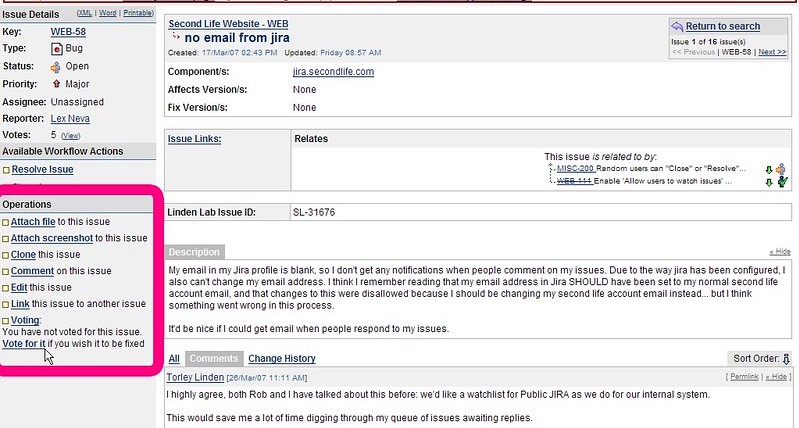
Jira now…
Make optional questions, optional!
You can still pose optional questions. But if it’s not information you need to have to provide the service, then wait and ask it later. In Web Form Design: Filling in the Blanks, Luke Wroblewski cites research indicating that users are more willing to answer optional questions if they’re posed after the initial form has been completed. With ProForma, you can automatically add a supplementary form when the initial form is completed. Alternatively, you can create a customer satisfaction survey in Jira to collect more information (See page 19 of Rachel Wright’s Jira Strategy Admin Workbook for instructions on deploying a minimal customer satisfaction survey in your Jira support project.).
Principle 2: Logical Structure
Now that you’ve decided what needs to be included on your form, you have to decide how to arrange it.
Your forms will be a lot more user-friendly if you think of them as one side of a conversation, rather than as a way to get info into your database.
Group questions into sections
A conversation usually starts with easy, non-intrusive questions. Questions in a conversation are grouped around larger topics, and they follow each other in a natural sequence. There are also natural breaks when a conversation shifts to a new topic. You can recreate that in your forms by grouping questions into sections, and by putting those sections – and their respective questions – in a logical order. This will provide context, making it easier for the user to understand what you’re asking for.
Keep introductory text to a minimum
Keep initial instructional text at the beginning of your form to a minimum. If it’s a big block of text users won’t read it anyway. Instead, provide general instructions in their corresponding sections, or better yet, use field-level help tips. Keeping the instructions close to the questions they refer to will eliminate confusion for the user.
There’s one important exception to this rule. It’s good to let people know up front what they will need, and if there are any eligibility criteria. Webforms also frequently include a “gateway” page or instruction section at the beginning for this purpose. Here’s an example:

Image courtesy of Rosenfeld Media
Use Pages, Tabs or Sections
Online forms often use multiple pages to organize the form into manageable parts. While we don’t have this capacity in Jira, you can organize questions onto different tabs. Similarly, ProForma lets you include multiple forms on an issue, making it easy to break up data collection into logical parts.
As above, if your form is embedded in a webpage, you can include a “thank you” page at the end that let’s the user know the form has been successfully submitted, and advises them about the next step in the process.
Principle 3: Clear Path to Completion
Since we know that no one likes to fill out forms, one thing we can do to lessen resistance and procrastination is to make it clear to the user how to get to the end. There are a few strategies you can use to illustrate a clear path to completion:
Consistency
If your team publishes a lot of different forms, use a consistent style when it comes to format, grouping questions, and the overall structure of your forms. This will make the forms feel familiar, and therefore less intimidating to your users.
Be upfront
If the user is going to need information that they’re not likely to have in their head, let them know upfront. Having to leave a task in progress to dig up needed info is frustrating for your users. It also provides a great opportunity for the user to abandon the process all together.
Easy to scan
You can also help users know what to expect by putting section titles in title case. (Section titles are also an item where you may want to use color.) Drawing the eye to section titles makes it easy for users to scan, letting them know what kind of questions to expect.
Vertical alignment
Finally, unless you’re asking for information that demands to be in a grid (e.g. budgets), keep your input fields in a straight vertical line. This makes it easy for the eye to see how to get to the end of the form. The path to completion is like a literal path – if it’s straight you can see where you’re going. If it’s full a switch backs it’s hard to know where you’re going or when you’ll get there.

“Switch backs” image courtesy of Rosenfeld Media
“Literal path” image courtesy of Rosenfeld Media
Creating a clear path to completion, using a logical structure and being as minimal as possible will make your forms more user-friendly and reduce the time needed to complete them. This will improve the quality of the data you receive. Of course, the real nitty-gritty detail of getting good data depends on asking good questions. We’ll dive into the details of form questions in the next article.
Other articles in this series:
- Why Form Design in Jira Matters – How you design your forms will impact the quality of data you receive, and much more!
- Layout and Flow: Creating User-Friendly Forms in Jira – Form layout affects completion rates and user frustration. We’ll discuss the right way to do it.
- Writing Good Form Questions in Jira: Part 1 – How do you choose the right words, field types and validation levels? This article will dig into the nitty gritty of creating good form questions.
- Writing Good Form Questions in Jira: Part 2 – Choice questions are great for collecting structured data. We’ll look at the options for choice questions and discuss ways to influence, or mitigated influence on the user.
- Things to think about when converting forms in Jira – Bringing a process into Jira for the first time? Don’t just copy forms straight across. This is a chance to make improvements.
- Efficient Jira Screens and Jira Service Desk Request Forms – Jira screens and JSD request forms aren’t the same. Here’s how you can make each one work for its audience.
- Tips for Creating good forms/screens in Jira – Learn how you can leverage Jira features like tabs, workflow transitions and icons to create better forms and screens.
Pingback: Good Form Questions in Jira: Part 1 - Strategy for Jira®
Pingback: Good Form Questions in Jira: Part 2 - Choice Questions & Conditional Logic - Strategy for Jira®
Pingback: Things to Think about When Converting Forms to Jira - Strategy for Jira®