
Questions and input fields are the heart of every form. In the previous article, we started digging in on the do’s and don’ts of creating good form questions. Now we’re going to take a closer look at a particular set of field types – choice questions.
The Power of Choice
There’s a lot to be said for choice questions. Choosing from a predetermined set of options is fast for the user. They don’t have to imagine what the possible answers might be, and they don’t have to spend their time typing.
If choice questions are good for the user, they’re awesome for the form owner and the database. They provide structured data that’s easy to aggregate, analyze and report on. They can also be used to trigger automation or conditional logic. As always, think about why you’re asking the question as you decide on field types, wording, and context.
Field Types for Choice Questions in Jira
There are multiple options for creating choice questions: Jira offers:
- Checkboxes
- Radio buttons
- Select lists (single, multiple and cascading)
- Picker fields (date, date and time, group(s), project, user(s), version(s).
ProForma includes:
- Check boxes,
- Radio buttons
- Dropdown boxes
- Pickers (date, time, date and time and user(s); ProForma also lets you create your own user picker fields by creating data connections that populate choice lists from an external source.
Determining which field type to use should be based on:
- Whether you want users to select one option only (radio buttons, dropdown, single choice select list), or more than one option (checkboxes, multiple choice select lists).
- Layout and available space on the form/screen – Radio buttons and checkboxes are fastest for users because they can see all of the choices at once, no extra clicks required. However, if you’re option list is excessively long, dropdown boxes let you save space on the screen.
Since choice questions already limit the user, when choosing field types it’s good practice to use the least restrictive option. Radio buttons, single select lists and dropdown boxes mean the user can only select one option. If there’s any possibility that the user would want to select more than one option, use check boxes or a multiple select list.
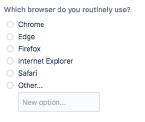
I use Chrome for work and Firefox for personal use, but the question only allows me to select one. The question should be narrowed (“Which browser do you use most often for work?”) or should be a check box field type to allow the user to select more than one option.
Things to Consider When Creating Choice Questions
- Make Sure Everyone Can Respond
The limitation of choice questions, is that they are closed. While this may be helpful to the form owner, it can be frustrating for the user. What if what they really want to choose isn’t listed as an option? One advantage of using ProForma is that it allows you to include an “Other” option, with an adjoining text field on your choice lists. Depending on how your question is phrased, it may be appropriate to offer options such as “I don’t know,” or “Not applicable”. The important thing is to make sure that your choices offer every user the opportunity to provide an honest answer. - Structure Your Rating Scales
Choice questions are often formatted as rating scales (strongly agree > strongly disagree, etc.) to measure user’s opinions or satisfaction. Carefully consider if you want an even or odd number of options. An odd number of options gives the user a chance to be neutral, while an even number forces them to give an opinion. (If you’re not going to make the user give you an opinion, is it really worth including the question?)- Label each point in your scale with words, so users don’t have to take the extra mental step of translating numbers into another meaning. Scales should not be too large, and the increment (in meaning) between each point on a scale should be equal.
- Points on a rating scale can either go from “lowest” to “highest” or vice versa. Scales are frequently structured with the most positive response listed first because users ofter select the first option they see. The important thing is to be consistent throughout your form.
- Avoid Double-Barreled Questions
Since the purpose of a form is to obtain structured data, it’s important that each question asks only one thing. This is especially true for choice questions. Otherwise, you’ll end up with a bunch of easy-to-categorize answers and have no idea what they refer to. Customer satisfaction surveys that ask you to agree or disagree with statements like, “The agent I spoke to was friendly and knowledgeable,“ miss the mark. What if the agent I spoke to was kind, but clueless? - When a Choice Really Isn’t a Choice
Sometimes we use choice questions when we’re really not offering the user a choice. The user has to say yes if they want to continue the process. In these cases, a checkbox is the correct field type since we are not excluding other options. In a previous article, I said that if you want users to read your instructions, you should avoid big blocks of text. The opposite is also true: If you want your users not to read something, make it long and full of jargon. John Oliver does a great job of describing how effective this is.
Choice Architecture
As with all form questions, you’ll want to use concise and unambiguous language. But creating good choice questions requires additional considerations. How you frame your questions can impact how users respond. This is called choice architecture. You may want to use it your advantage, or you may want to try to limit your influence to get a more “pure” response from your users.
The Influence of Defaults
One of the first decisions you’ll need to make is whether or not to include defaults. Defaults save time for the user. They also nudge the user in a certain direction. Users may perceive the default options as being recommended (after all, that’s what everyone else is choosing). In some cases, the default option may even be labeled as recommended. Even when logic doesn’t tell us to leave the default, inertia often does. We’re happy to avoid making a decision.
The most frequently cited examples of this mechanism at work are the differences in organ donation rates (cited in the first article of this series) add image and the use of “opting in” to get employees to contribute to retirement savings account. Parting with your organs, or your money, is a serious decision. Yet the evidence shows that many of us are happy to simply follow the default’s lead.
If you feel really confident that you know what the vast majority of users would want, use a default. If you want to encourage your users to make a certain choice, use a default. If you want to get more impartial data from your users, don’t use a default. Be cautious about offering a default for a required field. If the field is important enough to be required, you probably want your users to consider their answers, which they are less likely to do if a default is provided.
Choice Order Changes Results
Even if you don’t use a default, some bias will be built into your choice questions simply because you have to list the options in some kind of order. Inundated with information, our brains have learned to scan, which means we’ll pay more attention to the first and the last item in a list. In most cases, it’s sufficient to just put your choice options in some kind of logical order (lowest to highest, alphabetical, etc.). This makes it easy for the user to find the option they’re looking for. However, if you want to truly minimize the influence of the first/last bias, you need to randomize your choice options.
How Framing & Decoy Affects Impact Responses
How your question is perceived will be impacted by the words you choose. Here’s a example that frequently comes up when buying an airline ticket:

The words have been chosen carefully. Including the price of the flight reminds the user of the investment they’ve already made and makes the price of the insurance seem insignificant by comparison. The word “risk” also pushes the users towards buying the insurance.
In addition to wording, visual cues can be used to nudge a user to a certain choice. Here’s an example from Atlassian.
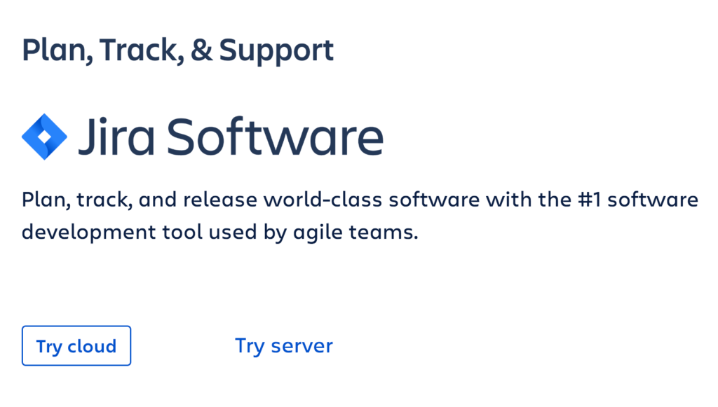
The Cloud option has an eye-catching button, while Server is a simple text link. Cloud is also the option on the left, where we usually find buttons like Save and Publish, as opposed to the right where we often see Cancel.
Another common practice is to make an item seem more appealing in comparison with the other choices on the list. This strategy is commonly seen on eCommerce sites. Personali™ offers this example from BestBuy.com. Compared to the $1,000 camera, the $45 memory card seems cheap. However, if the user were to search the site for memory cards, they’d find equivalent options at a much lower price.
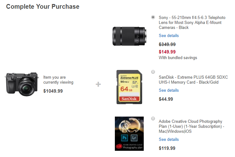
Image courtesy of Personali
It should be noted that, as with the examples of organ donation and employee retirement contributions, these kinds of strategies can be used for the user’s benefit, or – as with the examples from Best Buy and Atlassian – to push a product. The important thing is to be aware that when you create choice questions, you can (and frequently are) building in a bias. Therefore, you need to structure and word your choice questions carefully.
Conditional Logic
Along with being fast and easy for the user, and producing nice clean data for you, choice questions allow you to use conditional logic. Conditional logic allows you to dynamically show or hide form questions based on a user’s response to a previous question. This allows you to:
- Reduce cognitive overload for the user – the form looks less cluttered, less overwhelming.
- Shorten the user’s path to completion – the user only sees the parts of the form that are relevant to them. There’s no confusion about which parts they are supposed to fill out.
- Use one form for multiple, similar use cases.
- Accommodate edge cases.
Let’s look at a few examples.
An HR department is using Jira Service Desk to manage Personnel Action Notifications.
| When the form first loads it looks like this: | Other questions appear depending on what items need to be changed. |
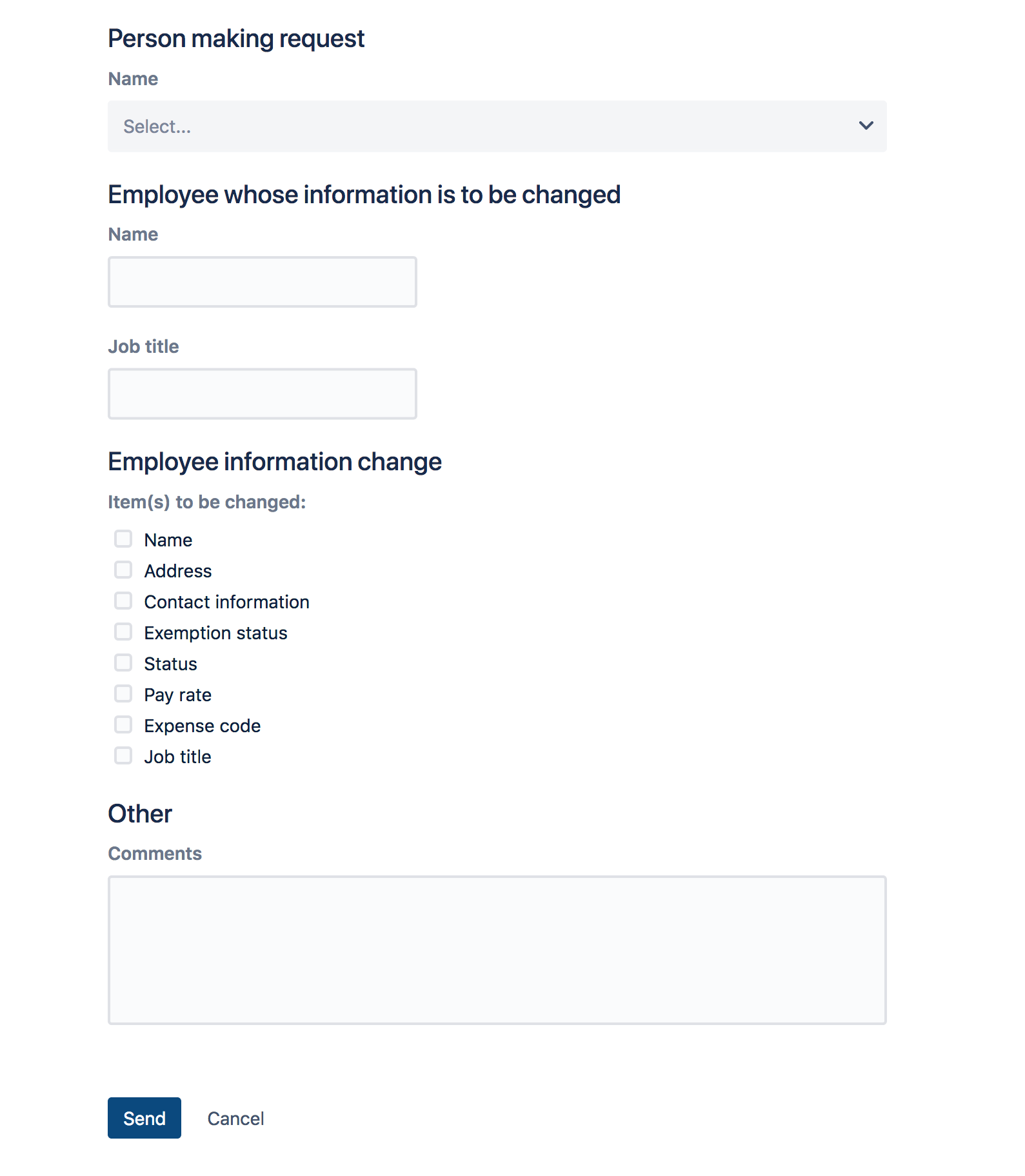 | 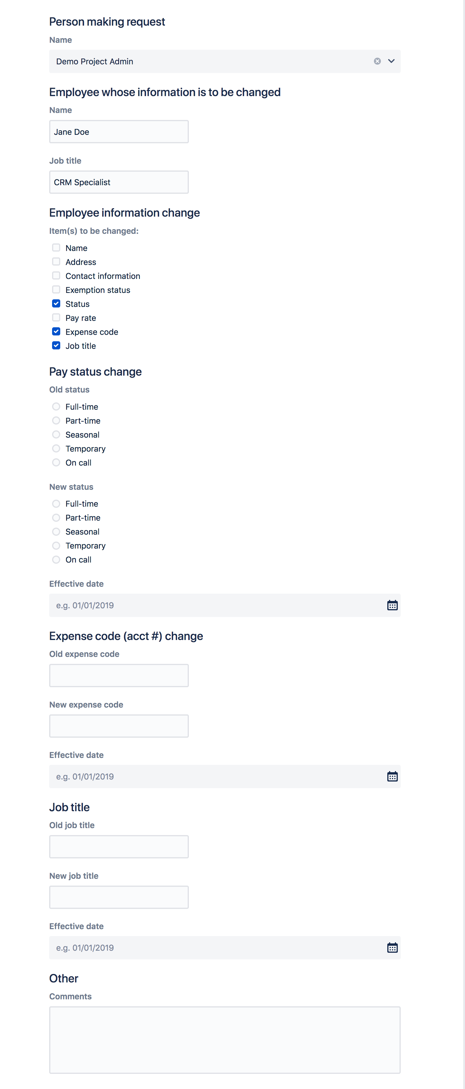 |
Conditional logic is one of the biggest advantages electronic forms have over paper forms. It’s also one of the best things you can do to make your forms more user-friendly – especially customer-facing forms on the JSD portal.
The ability to create forms in Jira, without dozens of custom fields or complex configurations, makes Jira and JSD a viable options for non-tech teams.
In our next article, we’ll look at things you should consider when helping those teams (or any team) bring their existing forms into Jira.
- Why Form Design in Jira Matters – How you design your forms will impact the quality of data you receive, and much more!
- Layout and Flow: Creating User-Friendly Forms in Jira – Form layout affects completion rates and user frustration. We’ll discuss the right way to do it.
- Writing Good Form Questions in Jira: Part 1 – How do you choose the right words, field types and validation levels? This article will dig into the nitty gritty of creating good form questions.
- Writing Good Form Questions in Jira: Part 2 – Choice questions are great for collecting structured data. We’ll look at the options for choice questions and discuss ways to influence, or mitigated influence on the user.
- Things to think about when converting forms in Jira – Bringing a process into Jira for the first time? Don’t just copy forms straight across. This is a chance to make improvements.
- Efficient Jira Screens and Jira Service Desk Request Forms – Jira screens and JSD request forms aren’t the same. Here’s how you can make each one work for its audience.
- Tips for Creating good forms/screens in Jira – Learn how you can leverage Jira features like tabs, workflow transitions and icons to create better forms and screens.