
Choosing the right Jira project type
Jira has multiple application types and each is built for a specific audience and use. In May 2024, Atlassian announced […]
Jira has multiple application types and each is built for a specific audience and use. In May 2024, Atlassian announced […]
It’s shocking, but many organizations don’t have a test environment! I didn’t have one when I first started out either. But
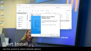
A test environment is a vital asset for any Jira administrator. It’s easy to create your own Jira Server or
If you’re only using Jira issue types to classify different types of work, you’re missing out! In addition to their
Instructions and tips for using a chat program as a central hub for Atlassian application notifications.
In case you need some inspiration, here are 65 ways you can use automation in Jira to make your life
Where are you on your Jira journey? Automation means different things to different people and we’re all likely at different
If you have Jira Software and Jira Service Management, how do you know which project admin links are for Jira
Sometimes it’s important to understand how far your Jira application has strayed from the default configuration. Was that setting there