
Update: A new navigation for Jira Cloud is here! The experience was fully delivered to all new and existing applications in June 2020. As of September 2020, the old navigation is no longer available for users to switch back to.
Atlassian is returning to Jira’s navigation roots by replacing the left sidebar menu with a top nav bar. Former Jira Server users will find the design very familiar.
Users are likely to adopt these changes quickly. My colleague, Chris Lutz, who has previously only used the vertical navigation, said the new look is really easy to get used to. He likes that his primary dashboard is easier to find and says “the new experience much more intuitive”.
Here’s a “before and after” comparison so you’re prepared when the change comes to your application.
Nav Comparison
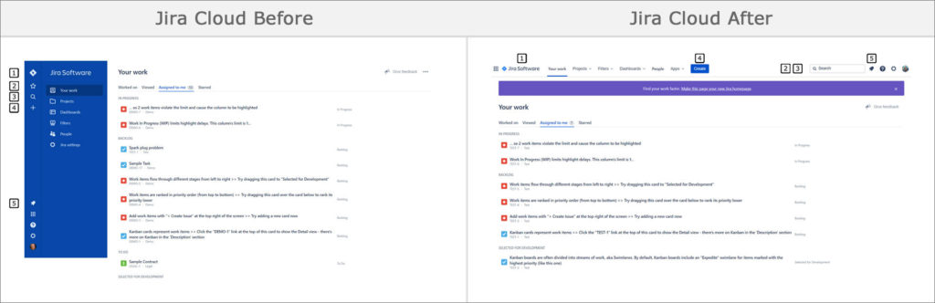
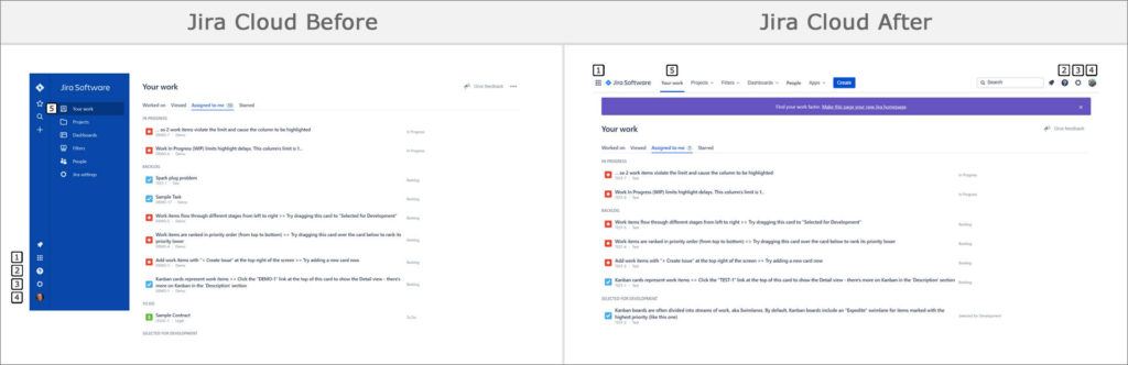
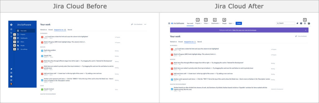
Compare the numbered areas in the left “before” image to their new location in the right “after” image.
View Comparison Graphic
- Jira logo – This is the “home” link. Click this to go to the “Your work” page. Before, only the icon was clickable. Now you can click anywhere on the Jira logo.
- “Starred and recent” icon – Your favorite and recently viewed items are now incorporated into the “Search” menu. Click in the text field to expand it and see your items.
- Magnifying glass icon – Search for issues and view recent boards, projects, and filters.
- Create button – Create new issues. The “+” icon is now a button labeled “Create”. It’s now located at the top middle of every Jira page.
- Notification bell icon – See notifications and updates on issues you’re watching.
View Comparison Graphic
- Application navigator icon – Switch to a different application or explore new Atlassian applications. The list of recent projects is now on the “Your work” page.
- Settings icon – Use the “gear” or “cog” icon to access application settings.
- Help icon – Use the “?” icon for the keyboard shortcuts list and links to documentation, the user community, and other resources.
- Avatar icon – Access your account and personal settings. When the new nav is available, you’ll be able to turn it on and off for a limited time.
- “Your work” page – See a list of issues assigned to you or worked on. See your recent or favorite issues, filters, boards, and dashboards.
View Comparison Graphic
- Projects link – The new experience shows favorite and recent projects in the drop down menu. Click the “View all projects” link for the list of all projects.
- Dashboards link – The new experience shows favorite and recent dashboards in the drop down menu. Click the “View all dashboards” link for the list of all dashboards. The order of the “Dashboards” and “Filters” links is switched in the new experience.
- Filters link – The new nav shows favorite and recent filters in the drop down menu. Click the “View all filters” link for the list of all filters. Click the “Advanced issue search” link to go to the Search page.
- People link – Search for people, search for teams, or create new teams.
- Settings link – This second Jira settings link is part of the
“gear” or “cog” icon on the top right of the new nav.

New Jira Cloud “Apps” Link 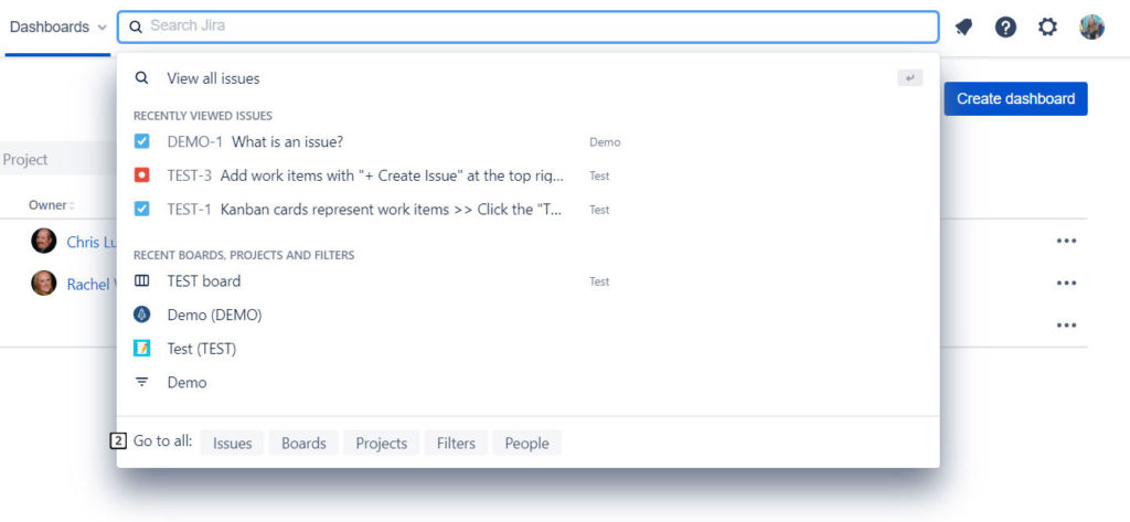
New Jira Cloud Search Bar 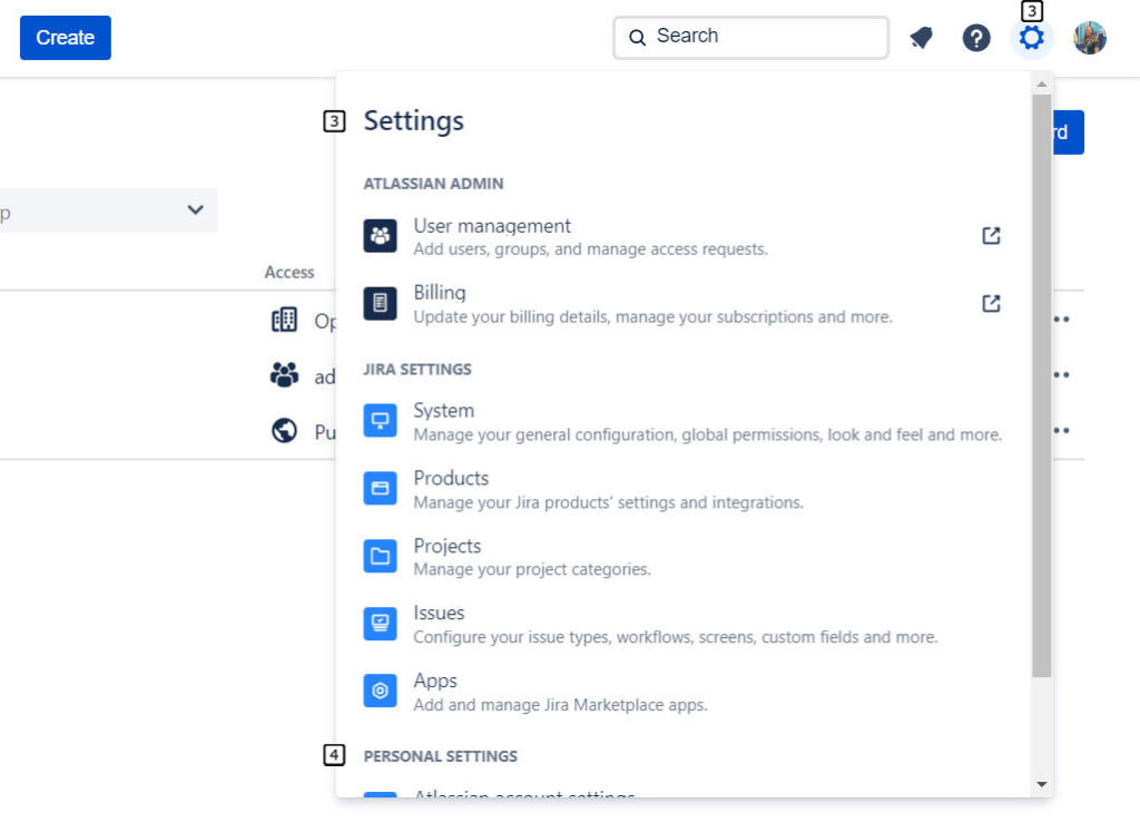
New Jira Cloud Admin and Personal Settings
- Apps link – If you have additional apps, links to their setting pages are displayed in the drop down menu.
- “Go to all” buttons – The “View all” label, at the bottom of the Search menu, is now “Go to all”. This feature is a quick way to jump to the search page and lists of projects, filters, and people. This the only way to access the list of boards.
- Settings menu – The options in this menu are reordered, with the “User management” and “Billing” links at the top.
- Personal settings – Links to manage your personal Atlassian account and personal settings are now included in this menu. This is the only way to access your Jira settings, like time zone, language, and email preferences.
Jira Cloud Before and After
Here are some comparison screenshots of commonly used Jira areas.
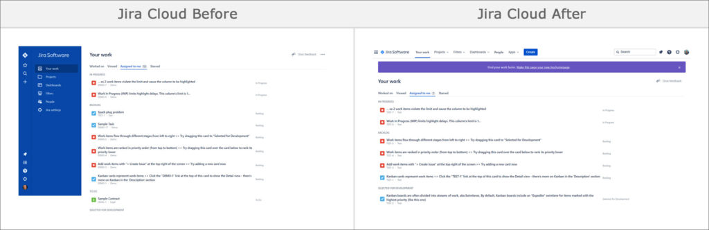
“Your work” Page
Click the purple banner at the top to make this page your homepage.
View Comparison Graphic | View Before Only | View After Only
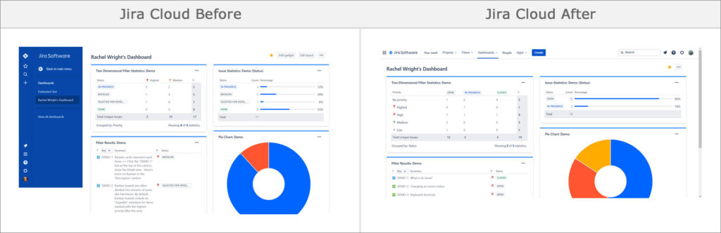
Dashboard
Without the blue left nav, there’s more horizontal space to display gadget data. You can favorite dashboards directly in the drop down menu.
View Comparison Graphic | View Before Only | View After Only
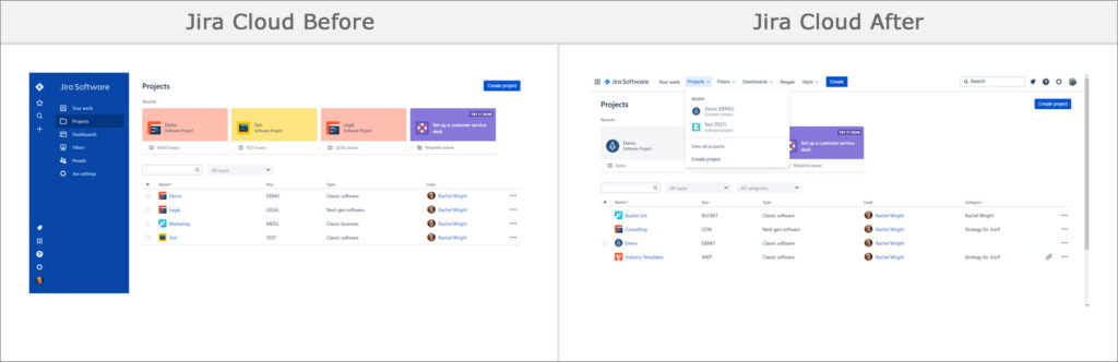
Projects List
In the new experience, the recent project colors are muted. You can favorite projects directly in the drop down menu.
View Comparison Graphic | View Before Only | View After Only
Board
Without the blue left nav, there’s more horizontal space to display issue cards. The grey project sidebar is still present and collapsible.
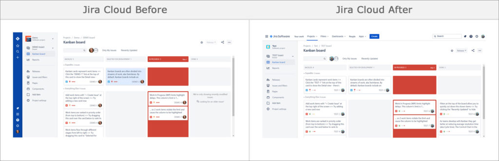
View Comparison Graphic | View Before Only | View After Only
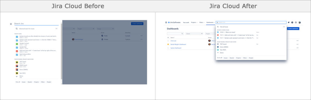
Search
The search feature moved from the left sidebar to the top right of the screen. Click the text box to see items in the drop down. More information fits easily in this space. A column showing the associated project was added to the display.
View Comparison Graphic | View Before Only | View After Only
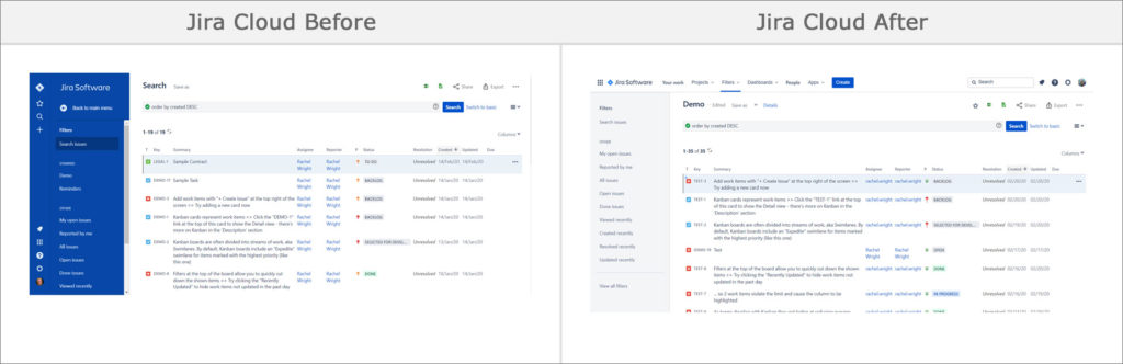
Search Results
Without the blue left nav, there’s more horizontal space to display columns. The grey “Filters” sidebar is still present and collapsible.
View Comparison Graphic | View Before Only | View After Only
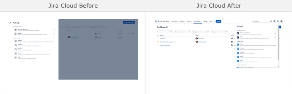
Settings
In the past, the “cog” or “gear” icon was only visible to application and project admins. Now everyone can see it. A “Personal Settings” section is added to the bottom of the menu.
View Comparison Graphic | View Before Only | View After Only
Application Navigator
The recent projects list is removed. See recent items on the “Your work” page instead.
View Comparison Graphic | View Before Only | View After Only
Project Admin Page
Without the blue left nav, there’s more horizontal space to display project configuration details. The grey project settings sidebar is still present and collapsible.
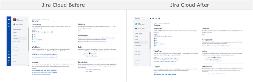
View Comparison Graphic | View Before Only | View After Only
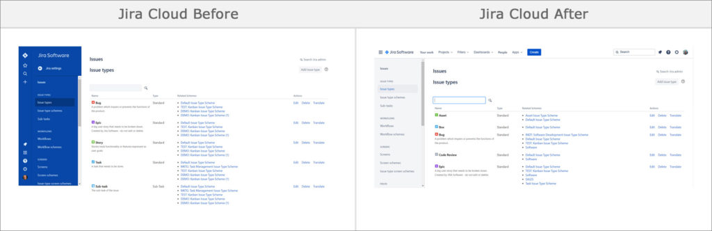
Issues Admin Page
Admins can access the admin pages with one less click. Without the blue left nav, there’s more horizontal space to display admin data. The grey admin sidebar is still present and collapsible.
View Comparison Graphic | View Before Only | View After Only
Navigation Controls
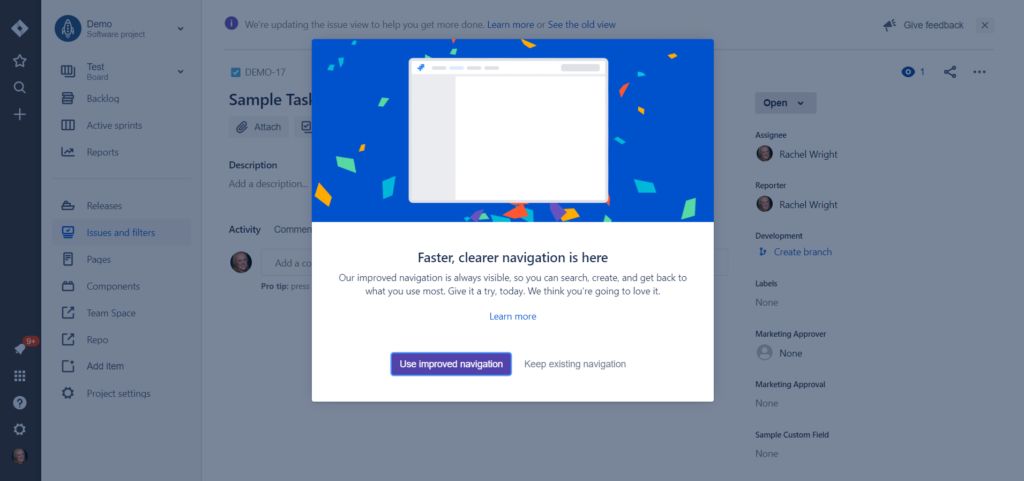
When your Jira Cloud application receives the new navigation, you’ll see an announcement overlay, similar to the one above. Users have the ability to use the new nav right away or delay it for later. If you opt to use the new nav, an on-screen wizard will guide you through the changes.
I recommend trying out the new nav right away. This change is inevitable and should help you find Jira information very quickly.
Like Atlassian history? Also read: Evolution of Jira Design
Pingback: Evolution of Jira Design - Strategy for Jira®
Great Insight. Thank You For Sharing.